

Typeface
Set of characters that share common design features
- 27 min read
- 9 chapters

Related on Lably
Through Letter (alphabet), Numerical digit and Symbol
There are thousands of different typefaces in existence, with new ones being developed constantly.
The profession of designing typefaces is called type design. Designers of typefaces are called type designers and are often employed by type foundries. In desktop publishing, type designers are sometimes also called "font developers" or "font designers." A typographer is someone who uses typefaces to design a page layout.
Every typeface is a collection of glyphs, each of which represents a grapheme – an individual letter, number, punctuation mark, or other symbol. There are typefaces tailored for special applications, such as cartography, astrology or mathematics.
Terminology
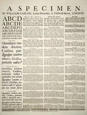
In professional typography, the term typeface is not interchangeable with the word font. The term font has historically been defined as a given set of character shapes in a single size. For example, 8-point Caslon Italic was one font, and 10-point Caslon Italic was another. Historically, a font came from a type foundry as a set of "sorts", with a number of copies of each character included.
As the range of typeface designs increased and requirements of publishers broadened over the centuries, fonts of specific weight (blackness or lightness) and stylistic variants—most commonly regular or roman as distinct from italic, as well as condensed—have led to font families, collections of closely related typeface designs that can include hundreds of styles. A typeface family is typically a group of related typefaces which vary only in weight, orientation, width, etc., but not design. For example, Times is a typeface family, whereas Times Roman, Times Italic and Times Bold are individual typefaces making up the Times family. Typeface families typically include several typefaces, though some, such as Helvetica, may consist of dozens of fonts. In traditional typography, a font family is a set of fonts within the same typeface: for example Times Roman 8, Times Roman 10, Times Roman 12, etc. In web typography, the term "font family", as specified using the HTML code style="font-family: ___", may equate to a "typeface family" or to a very broad category such as sans-serif that encompass many typeface families.
Another way to look at the distinction between a computer font and a typeface is that a computer font is the vessel—e.g. the software—that provides a set of characters with a given appearance, whereas a typeface is the actual design of such characters. Therefore, a given typeface, such as Times, may be rendered by different fonts, such as digital font files created by this or that vendor, a set of metal type characters etc. In the metal type era, a font also meant a specific point size, but with digital scalable outline fonts this distinction is no longer used, as a single font may be scaled to any size.
The first "extended" font families, which included a wide range of widths and weights in the same general style emerged in the early 1900s, starting with ATF's Cheltenham (1902–1913), with an initial design by Bertram Grosvenor Goodhue, and many additional faces designed by Morris Fuller Benton. Later examples include Futura, Lucida, ITC Officina. Some became superfamilies as a result of revival, such as Linotype Syntax, Linotype Univers; while others have alternate styling designed as compatible replacements of each other, such as Compatil, Generis
Font superfamilies began to emerge when foundries began to include typefaces with significant structural differences, but some design relationship, under the same general family name. Arguably the first superfamily was created when Morris Fuller Benton created Clearface Gothic for ATF in 1910, a sans-serif companion to the existing (serifed) Clearface. From a typographer's perspective, the "superfamily" designation does not include sets of unrelated typefaces marketed with the same or similar family names. For example, the foundries that market Caslon Antique and Futura Black and Display named them in association with the Caslon and Futura families despite being structurally unrelated to those families. Consequently, typographers do not consider Caslon Antique and Futura Black/Display to be valid members of any Caslon or Futura 'superfamily'.
Additional or supplemental glyphs intended to match a main typeface have been in use for centuries. In some formats they have been marketed as separate fonts. In the early 1990s, the Adobe Systems type group introduced the idea of expert set fonts, which had a standardized set of additional glyphs, including small caps, old style figures, and additional superior letters, fractions and ligatures not found in the main fonts for the typeface. Supplemental fonts have also included alternate letters such as swashes, dingbats, and alternate character sets, complementing the regular fonts under the same family. However, with introduction of font formats such as OpenType, those supplemental glyphs were merged into the main fonts, relying on specific software capabilities to access the alternate glyphs.
Since Apple's and Microsoft's operating systems supported different character sets in the platform related fonts, some foundries used expert fonts in a different way. These fonts included the characters which were missing on either Macintosh or Windows computers, e.g. fractions, ligatures or some accented glyphs. The goal was to deliver the whole character set to the customer regardless of which operating system was used.
Anatomy
Typographers have developed a comprehensive vocabulary for describing the many parts and attributes of typefaces, fonts, and glyphs. Some only apply to certain writing systems: here, "LGC" refers to Latin script, Greek script, and Cyrillic script; and "CJK" refers to Chinese script, Japanese script, and Korean script.
- A stroke is a line or curve that is part of an LGC letter; CJK strokes can include compound shapes written in a single movement of a brush.
- The stroke ending for LGC letters can have serifs or a variety of sans serif (without serif) terminals
- Characters in a typeface can be variable-width (proportional) or fixed-width (monospaced). Chinese and Japanese characters are often displayed on a grid (with reading lines either left-to-right or top-to-bottom). Characters like Latin letters and Arabic numerals and kana have halfwidth and fullwidth forms which can fit this grid. A font with a mix of only halfwidth and fullwidth characters is a duospaced font.
- In LGC fonts, from the baseline (bottom of most letters) is measured the descender height (e.g. the bottom of "p"), the x-height (top of "x"), the cap height (top of a capital letter like "S"), and ascender height (height above the top of a lowercase "x", potentially higher than cap height).
- LGC typefaces typically have Arabic digits the same height as capital letters. In a typeface with text figures, Arabic digits blend in with lowercase letters more, as some are x-height and some have descenders or ascenders.
- Some proportional fonts have fixed-width Arabic digits, known as tabular figures.
Sizing
The size of typefaces and fonts is traditionally measured in points; point has been defined differently at different times, but now the most popular is the Desktop Publishing point of 1⁄72 in (0.0139 in or 0.35 mm). When specified in typographic sizes, such as points or kyus, the height of an em-square, an invisible box which is typically a bit larger than the distance from the tallest ascender to the lowest descender, is scaled to equal the specified size. For example, when setting Helvetica at 12 point, the em square defined in the Helvetica font is scaled to 12 points or 1⁄6 in or 4.2 mm. Yet no particular element of 12-point Helvetica need measure exactly 12 points.
Frequently measurement in non-typographic units—feet, inches, meters—is of the cap-height, the height of the capital letters. Font size is also commonly measured in millimeters (mm) and qs—which is a quarter of a millimeter, kyu in romanized Japanese—and inches.
Simply scaling a shape to be larger or smaller does not necessarily produce an aesthetically pleasing result. The intended physical viewing size of a font is called its optical size.
Sign in to keep reading
8 more chapters are free with a Lably account.
History
The technology of printing text using movable type was invented in China, but the vast number of Chinese characters, and the esteem in which calligraphy was held, meant that few distinctive, complete typefaces were created in China in the early centuries of printing.
Gutenberg's most important innovation in the mid-15th-century development of his press was not printing itself, but the casting of Latinate types. Unlike Chinese characters, which are based on a uniform square area, European Latin characters vary in width, from the very wide "M" to the slender "l". Gutenberg developed an adjustable mold which could accommodate an infinite variety of widths. From then until at least 400 years later, type started with cutting punches, which would be struck into a brass "matrix". The matrix was inserted into the bottom of the adjustable mold and the negative space formed by the mold cavity plus the matrix acted as the master for each letter that was cast. The casting material was an alloy usually containing lead, which has a low melting point, cools readily, and can easily be filed and finished. In those early days, type design had to not only imitate the handwritten forms familiar to readers, but also account for the limitations of the printing process, such as rough papers of uneven thickness, the squeezing or splashing properties of the ink, and the eventual wear on the type itself.
Type foundries have cast fonts in lead alloys from the 1450s until the present, although wood served as the material for some large fonts called wood type during the 19th century, particularly in the United States.
Beginning in the 1890s, each character was drawn in a very large size for the American Type Founders Corporation and a few others using their technology—over a foot (30 cm) high. The outline was then traced by a Benton pantograph-based engraving machine with a pointer at the hand-held vertex and a cutting tool at the opposite vertex down to a size usually less than a quarter-inch (6 mm). The pantographic engraver was first used to cut punches, and later to directly create matrices. This mechanization of typesetting allowed automated casting of fonts on the fly as lines of type in the size and length needed. This was known as continuous casting, and remained profitable and widespread until its demise in the 1970s. The first machine of this type was the Linotype machine, invented by Ottmar Mergenthaler.
During a brief transitional period (c. 1950s–1990s), typesetting moved from metal to photo composition. Phototypesetting utilized tiny high-resolution images of individual glyphs on a film strip in the form of a film negative, with the letters as clear areas on an opaque black background. A high-intensity light source behind the film strip projected the image of each glyph through an optical system, which focused the desired letter onto the light-sensitive phototypesetting paper at a specific size and position. This photographic typesetting process permitted optical scaling, allowing designers to produce multiple sizes from a single font, although physical constraints on the reproduction system used still required design changes at different sizes; for example, ink traps and spikes to allow for spread of ink encountered in the printing stage. Manually operated photocomposition systems using fonts on filmstrips allowed fine kerning between letters without the physical effort of manual typesetting, and spawned an enlarged type design industry in the 1960s and 1970s.
During this time, type design made a similar transition from physical matrices to hand-drawn letters on vellum or mylar and then the precise cutting of "rubyliths". Rubylith was a common material in the printing trade, in which a very soft, pliable transparent red film was bonded to a supporting clear acetate. Placing the ruby over the master drawing of the letter, the craftsman would gently and precisely cut through the upper film and peel the non-image portions away. The resulting letterform, now existing as the remaining red material still adhering to the clear substrate, would then be ready to be photographed using a reproduction camera.
By the mid-1970s, all of the major typeface technologies and all their fonts were in use: letterpress; continuous casting machines; phototypesetters; computer-controlled phototypesetters; and the earliest digital typesetters—bulky machines with primitive processors and CRT outputs.
With the widespread adoption of computers, type design became a form of computer graphics. Initially, this transition occurred with a program called Ikarus around 1980, but widespread transition began with programs such as Aldus Freehand and Adobe Illustrator, and finally to dedicated type design programs called font editors, such as Fontographer and FontLab. This process occurred rapidly: by the mid-1990s, virtually all commercial type design had transitioned to digital vector drawing programs.
Each glyph design can be drawn or traced by a stylus on a digitizing board, or modified from a scanned drawing, or composed entirely within the program itself. Each glyph is then in a digital form, either in a bitmap (pixel-based) or vector (scalable outline) format. A given digitization of a typeface can easily be modified by another type designer; such a modified font is usually considered a derivative work, and is covered by the copyright of the original font software.
From the mid-1980s, as digital typography has grown, users have almost universally adopted the American spelling "font", which has come to primarily refer to a computer file containing scalable outline letterforms in digital font, in one of several common formats. Some typefaces, such as Verdana, are designed primarily for use on computer screens.
Digital type
Digital type became the dominant form of type in the late 1980s and early 1990s. Digital fonts store the image of each character either as a bitmap in a bitmap font, or by mathematical description of lines and curves in an outline font, also called a vector font. Bitmap fonts were more commonly used in the earlier stages of digital type, and are rarely used today. These bitmapped typefaces were first produced by Casady & Greene, Inc. and were also known as Fluent Fonts. Fluent Fonts became mostly obsolete with the creation of downloadable PostScript fonts, and these new fonts are called Fluent Laser Fonts (FLF). Stroke fonts save space by vectorizing strokes, allowing different widths to be automatically generated. They are a popular and efficient way to represent CJK characters.
When an outline font is used, a rasterizing routine in the application software, operating system or printer renders the character outlines, interpreting the vector instructions to decide which pixels should be black and which ones white. Rasterization is straightforward at high resolutions such as those used by laser printers and in high-end publishing systems. For computer screens, where each individual pixel can mean the difference between legible and illegible characters, some digital fonts use hinting algorithms to make readable bitmaps at small sizes.
Digital fonts may also contain data representing the metrics used for composition, including kerning pairs, component creation data for accented characters, glyph substitution rules for Arabic typography and for connecting script faces, and for simple everyday ligatures like "fl". Common font formats include TrueType, OpenType and PostScript Type 1, while Metafont is still used by TeX and its variants. Applications using these font formats, including the rasterizers, appear in Microsoft and Apple Computer operating systems, Adobe Systems products and those of several other companies. Digital fonts are created with font editors such as FontForge, RoboFont, Glyphs, Fontlab's TypeTool, FontLab Studio, Fontographer, or AsiaFont Studio.
Style of typefaces
Because an abundance of typefaces has been created over the centuries, they are commonly categorized according to their appearance. At the highest level in the context of Latin-script fonts, one can differentiate roman, blackletter, and Gaelic types. Roman types are in the most widespread use today, and are sub-classified as serif, sans-serif, ornamental, and script types. Historically, the first European fonts were blackletter, followed by roman serif, then sans-serif and then the other types. The use of Gaelic faces was restricted to the Irish language, though these form a unique if minority class. Typefaces may be monospaced regardless of whether they are roman, blackletter, or Gaelic. Symbol typefaces are non-alphabetic. The Cyrillic script comes in two varieties, roman-appearance type (called гражданский шрифт, graždanskij šrift) and traditional Slavonic type (called славянский шрифт, slavjanskij šrift).
Roman (or Regular), italic, and oblique are terms used to differentiate between upright and two possible slanted forms of a typeface. Italic and oblique fonts are similar—indeed, oblique fonts are often simply called italics—but there is a difference: italic applies to fonts where the letter forms are redesigned, not just slanted. Almost all serif faces have italic forms; some sans-serif faces have oblique designs. Most faces do not offer both as this is an artistic choice by the font designer about how the slanted form should look.
Serif typefaces
Serif typefaces (also called "Roman" types for their appearance rather than orientation) are named for the features at the ends of their strokes. Times New Roman and Garamond are common examples of serif typefaces. Serif fonts are probably the most used class in printed materials, including most books, newspapers and magazines. Serif fonts are often classified into three subcategories: Old Style, Transitional, and Didone or Modern, representative examples of which are Garamond, Baskerville, and Bodoni respectively.
Old Style typefaces are influenced by early Italian lettering design. Modern fonts often exhibit a bracketed serif and a substantial difference in weight within the strokes. Though some argument exists as to whether Transitional fonts exist as a discrete category among serif fonts, Transitional fonts lie somewhere between Old Style and Modern style typefaces. Transitional fonts exhibit a marked increase in the variation of stroke weight and a more horizontal serif compared to Old Style. Slab serif designs have particularly large serifs, and date to the early nineteenth century. The earliest known slab serif font was first shown around 1817 by the English typefounder Vincent Figgins.
Sans-serif typefaces
Sans-serif (lit. without serif) designs appeared relatively recently in the history of type design. The first, similar to slab serif designs, was shown in 1816 by William Caslon IV. Many have minimal variation in stroke width, creating the impression of a minimal, simplified design. When first introduced, the faces were disparaged as "grotesque" (or "grotesk") and "gothic": but by the late nineteenth century were commonly used for sans-serif without negative implication.
The major sub-classes of Sans-serif are "Grotesque", "Neo-grotesque", "Geometric" and "Humanist".
Blackletter typefaces
"Blackletter" is the name of the class of typefaces used with the earliest printing presses in Europe, which imitated the calligraphy style of that time and place. Various forms exist including textualis, rotunda, schwabacher and fraktur. Some people refer to blackletter as "Gothic script" or "Gothic font", though the term "gothic" in typography refers to sans-serif typefaces.
Gaelic typefaces
Gaelic fonts were first used for the Irish language in 1571, and were used regularly for Irish until the early 1960s, though they continue to be used in display type and type for signage. Their use was effectively confined to Ireland, though Gaelic typefaces were designed and produced in France, Belgium, and Italy. Gaelic typefaces make use of insular letterforms, and early fonts made use of a variety of abbreviations deriving from the manuscript tradition. Various forms exist, including manuscript, traditional, and modern styles, chiefly distinguished as having angular or uncial features.
Monospaced typefaces
Monospaced fonts are typefaces in which every glyph is the same width, as opposed to variable-width fonts, where the w and m are wider than most letters, and the i is narrower. The first monospaced typefaces were designed for typewriters, which could only move the same distance forward with each letter typed. Their use continued with early computers, which could only display a single font. Although modern computers can display any desired typeface, monospaced fonts are still important for computer programming, terminal emulation, and for laying out tabulated data in plain text documents; they may also be particularly legible at small sizes due to all characters being quite wide. Examples of monospaced typefaces are Courier, Prestige Elite, Fixedsys, and Monaco. Most monospaced fonts are sans-serif or slab-serif as these designs are easiest to read printed small or display on low-resolution screens, though many exceptions exist.
CJK typefaces
CJK, or Chinese, Japanese and Korean typefaces consist of large sets of glyphs. These typefaces originate in the glyphs found in brush calligraphy during the Tang dynasty. These later evolved into the Song style (宋体字) which used thick vertical strokes and thin horizontal strokes in wood block printing.
The glyphs found in CJK fonts are designed to fit within a square. This allows for regular vertical, horizontal, right-to-left and left-to-right orientations. CJK fonts can also include an extended set of monospaced Latin characters. This commonly results in complex, sometimes contradictory rules and conventions for mixing languages in type.
Mincho
With CJK typefaces, Mincho style tends to be something like serifs for the end of stems, and in fact includes serifed glyphs for Extended Latin and Cyrillic sets within a typeface.
Gothic
With CJK typefaces, Goth style tends to be something like sans-serifs with squarish, cut off end-caps for the end of stems, and in fact includes sans-serif glyphs for Extended Latin and Cyrillic sets within a typeface.
Maru
With CJK typefaces, Maru style tends to be something like sans-serifs with rounded end-caps for the end of stems, and in fact includes rounded sans-serif glyphs for Extended Latin and Cyrillic sets within a typeface.
Display type
Display type refers to the use of type at large sizes, perhaps 30 points or larger. Some typefaces are considered useful solely at display sizes, and are known as display faces. Most effect typefaces are display types. Common features of display type include tighter default letter spacing, finer details and serifs, slightly more condensed letter shapes and larger differences between thick and thin strokes; many of these are most visible in serif designs. Many display typefaces in the past such as those intended for posters and newspaper headlines were also only cut in capitals, since it was assumed lower-case would not be needed, or at least with no italics. This was true of many early sans-serif fonts.
In the days of metal type, when each size was cut individually, types intended for display use were often adjusted accordingly. These modifications continued to be made even after fonts started to be made by scaling using a pantograph, but began to fade away with the advent of phototypesetting and then digital fonts, which can both be printed at any size. Premium digital fonts used for magazines, books and newspapers do often include display variants, but they are often not included with typefaces bundled with operating systems and desktop publishing software. Display typefaces in the letterpress period were often made as wood type, being lighter than metal.
Decades into the desktop publishing revolution, few typographers with metal foundry type experience are still working, and few digital typefaces are optimized specifically for different sizes, so the misuse of the term display typeface as a synonym for ornamental type has become widespread; properly speaking, ornamental typefaces are a subcategory of display typefaces. At the same time, with new printing techniques, typefaces have largely replaced hand-lettering for very large signs and notices that would once have been painted or carved by hand.
Script typefaces
Script typefaces imitate handwriting or calligraphy. They do not lend themselves to quantities of body text, as people find them harder to read than many serif and sans-serif typefaces; they are typically used for logos or invitations. Historically, most lettering on logos, displays, shop frontages did not use fonts but was rather custom-designed by signpainters and engravers, so many emulate the styles of hand-drawn signs from different historical periods. The genre has developed rapidly in recent years due to modern font formats allowing more complex simulations of handwriting. Examples include Coronet, a simple design from 1937, and Zapfino,a much more complicated digital design.
Mimicry typefaces
Mimicry typefaces are decorative typefaces that have been designed to represent characters of one alphabet but at the same time evoke another writing system. This group includes roman typefaces designed to appear as Arabic, Chinese characters (Wonton fonts), Cyrillic (Faux Cyrillic), Indic scripts, Greek (an example being Lithos), Hebrew (Faux Hebrew), Kana, or Thai. These are used largely for the purpose of novelty to make something appear foreign, or to make businesses offering foreign products, such as restaurants, clearly stand out. This typographic mimicry is also known as a faux font, named faux x, where x is usually a language script; pseudoscript; ethnic typeface; simulation typeface or a "foreign look" font.
Reverse-contrast typefaces
A reverse-contrast type is a typeface in which the stress is reversed from the norm: instead of the vertical lines being the same width or thicker than horizontals, which is normal in Latin-alphabet printing, the horizontal lines are the thickest. Reverse-contrast types are rarely used for body text, and are particularly common in display applications such as headings and posters, in which their unusual structure may be particularly eye-catching. First seen in London in 1821, they were particularly common in the mid- to late nineteenth century in American and British printing and have been revived occasionally since then. They effectively become slab serif designs because of the serifs becoming thick, and are often characterized as part of that genre. In recent times, the reverse-contrast effect has been extended to other kinds of typeface, such as sans-serif designs.
Effect typefaces
Some typefaces have a structure that suggests a three-dimensional letter, such as letters carved into stone. An example of this is the genre known as "inline", "block" "outline" or "shadowed" typefaces. This renders the interior of glyphs in the background color, with a thin line around the edges of the glyphs. In some cases, the outline shows the glyph filled in with the foreground color, surrounded by a thin outline mirroring the edges separated by a small gap. This latter style is often used with "college" typefaces. Colorized block lettering is often seen in carefully rendered graffiti.
A "shadow" effect can also be either designed into a typeface or added to an existing typeface. Designed-in shadows can be stylized or connected to the foreground. An after-market shadow effect can be created by making two copies of each glyph, slightly offset in a diagonal direction and possibly in different colors. Drop shadows can also be dynamically created by rendering software. The shadow effect is often combined with the outline effect, where the top layer is shown in white with black outline and the bottom layer in black, for greater contrast. An example typeface with an "inline" effect is Imprint Shadowed, where the shadowed version is more widely distributed than the regular design.
Small print typefaces
Some typefaces are specifically designed to be printed at small sizes, for example in telephone directories or on newsprint paper. Bell Gothic and Bell Centennial, commissioned for telephone directories, are notable examples of this. Small-print designs often feature a large x-height, and a chunky design. Some fonts used at such sizes may be members of a larger typeface family joining members for normal sizes. For example, the Times New Roman family contains some designs intended for small print use, as do many families with optical sizes such as Minion.
In the metal type era, typefaces intended to be printed small contained ink traps, small indentations at the junctions of strokes that would be filled up with ink spreading out, maintaining the intended appearance of the type design. Without ink traps, the excess ink would blob and ruin the crisp edge. At larger sizes, these ink traps were not necessary, so display faces did not have them. They have also been removed from most digital fonts, as these will normally be viewed on screen or printed through inkjet printing, laser printing, offset lithography, electrophotographic printing or other processes that do not show the ink spread of letterpress. Ink traps have remained common on designs intended to be printed on low-quality, absorbent paper, especially newsprint and telephone directories.
Typeface family
A typeface family (or type family) is a set of typefaces that share a common design concept. The simplest typeface family has just a "regular" face and an "oblique" face (or "roman" and "italic"); the next step up adds boldface versions of these types. A modern professional typeface family (such as Danish Standard no. 737) might have as many as 54 different styles: condensed, normal and expanded forms of each of "thin", "extralight", "light", "regular", "medium", "demibold", "bold", "extrabold" and "heavy" types, in regular and italic.
Texts used to demonstrate typefaces
A sentence that uses all of the alphabet (a pangram), such as "The quick brown fox jumps over the lazy dog", is often used as a design aesthetic tool to demonstrate the personality of a typeface's characters in a setting, because it displays all the letters of the alphabet. For extended settings of typefaces graphic designers often use nonsense text commonly referred to as greeking, such as lorem ipsum or Latin text such as the beginning of Cicero's In Catilinam. Greeking is used in typography to determine a typeface's color, or weight and style, and to demonstrate an overall typographic aesthetic prior to actual type setting. Common demonstration words or 'control words' include "Hamburgevons", "adhesion", or "videospan".
Non-character typefaces
The process of printing typefaces has historically been far simpler than commissioning and engraving custom illustrations, especially as many non-text features of printed works like symbols and borders were likely to be reused by a printer in future. Non-character typefaces have therefore been created for elements of documents that are not letters but are likely to be reused regularly.
Ornamental typefaces
Ornamental (also known as novelty or sometimes display) typefaces are used to decorate a page. Historically complex interlocking patterns known as arabesques were common in fine printing, as were floral borders known as fleurons evoking hand-drawn manuscripts.
In the metal type era, type-founding companies often would offer pre-formed illustrations as fonts showing objects and designs likely to be useful for printing and advertisements, the equivalent of modern clip art and stock photographs. As examples, the American Type Founders specimen of 1897 offered designs including baseball players, animals, Christmas wreaths, designs for cheques, and emblems such as state seals for government printing. The practice has declined as printing custom illustrations and colour printing using processes such as lithography has become cheaper, although illustration typefaces are still sold by some companies.
Symbol typefaces
Symbol, or dingbat, typefaces consist of symbols—such as decorative bullets, clock faces, railroad timetable symbols, CD-index, or TV-channel enclosed numbers—rather than normal text characters. Common, widely used symbol typeface releases include Zapf Dingbats and Wingdings, though many may be created internally by a publication for its own use and some typefaces may have a symbol range included. Marlett is an example of a font used by Windows to draw elements of windows and icons.
Emoji
Emoji are pictograms that can be used and displayed inline with text. They are similar to previous symbol typefaces, but with a much larger range of characters, such as symbols for common objects, animals, food types, weather and emotions. Originally developed in Japan, they are now commonly installed on many computer and smartphone operating systems. Following standardisation and inclusion in the Unicode standard, allowing them to be used internationally, the number of Emoji characters has rapidly increased to meet the demands of an expanded range of cultures using them; unlike many previous symbol typefaces, they are interchangeable with the ability to display the pictures of the same meaning in a range of fonts on different operating systems. The popularity of emoji has meant that characters have sometimes gained culture-specific meanings not inherent to the design. Both colour and monochrome emoji typefaces exist, as well as at least one animated design.
Type design
Design principles
Designing a legible text-based typeface remains one of the most challenging assignments in graphic design. The even visual quality of the reading material is paramount; the letterform of each drawn character (called a glyph) must be consistent in appearance with every other glyph in the typeface, regardless of order or sequence. Also, if the typeface is required to be versatile, it must appear the same whether it is small or large. Because of optical illusions that occur when we apprehend small or large objects, this entails that in the best typefaces, a set of fonts (or a scalable computer font) is designed for small use and another set is drawn for large, display applications. Also, large letterforms reveal their shape, whereas small letterforms in text settings reveal only their textures: this requires that any typeface that aspires to versatility in both text and display needs to be evaluated in both of these visual domains. A beautifully shaped typeface may not have a particularly attractive or legible texture when seen in text settings.
Spacing is also an important part of type design. Each glyph consists not only of the shape of the character, but also the white space around it. The type designer must consider the relationship of the space within a letter form (the counter) and the letter spacing between them.
Designing type requires many accommodations for the quirks of human perception, "optical corrections" required to make shapes look right, in ways that diverge from what might seem mathematically correct. For example, round shapes need to be slightly bigger than square ones to appear "the same" size (overshoot), and vertical lines need to be thicker than horizontal ones to appear the same thickness. For a character to be perceived as geometrically round, it must usually be slightly "squared" off (made slightly wider at the shoulders).
Type design profession
The creation of typeface letterforms, or type design, is performed by a type designer. It is a craft, blending elements of art and science. It is the task of the typographer (or typesetter) to lay out a page using a typeface that is appropriate to the work to be printed or displayed.
In the pre-digital era, type design it was primarily learned through apprenticeship and professional training within the industry. Since the mid-1990s it has become the subject of dedicated degree programs at a handful of universities, including the MA Typeface Design at the University of Reading (UK) and the Type Media program at the KABK (Royal Academy of Art in the Hague). At the same time, the transition to digital type and font editors which can be inexpensive (or even open source and free) has led to a great democratization of type design; the craft is accessible to anyone with the interest to pursue it; nevertheless, it may take a very long time for the serious artist to master.
Intellectual property
Typefaces, fonts, and their glyphs raise intellectual property considerations in copyright, trademark, design patent, and related laws. The copyright status of a typeface and of any font file that describes it digitally varies between jurisdictions. In the United States, the shapes of typefaces are not eligible for copyright but may be protected by design patent (although it is rarely applied for, the first US design patent that was ever awarded was for a typeface). Typefaces can be protected in other countries, including the United Kingdom, Germany, and France, by industrial design protections that are similar to copyright or design patent in that they protect the abstract shapes. Additionally, in the US and some other countries, computer fonts, the digital instantiation of the shapes as vector outlines, may be protected by copyright on the computer code that produces them. The name of a typeface may also be protected as a trademark.